This was a full-semester project for Professor Paul Nini's brand identity design class. The task was to redesign a non-profit organization's brand identity from the ground up. I chose the Coffee Trust for my non-profit, who are an organization devoted to helping the Guatemalan coffee farming economy. They provide educational services for both farmers themselves and prospective donors to the cause, as well as business opportunities for the farmers to expand with. Below is the brand guide for the new identity, and the process that was behind it.

Cover

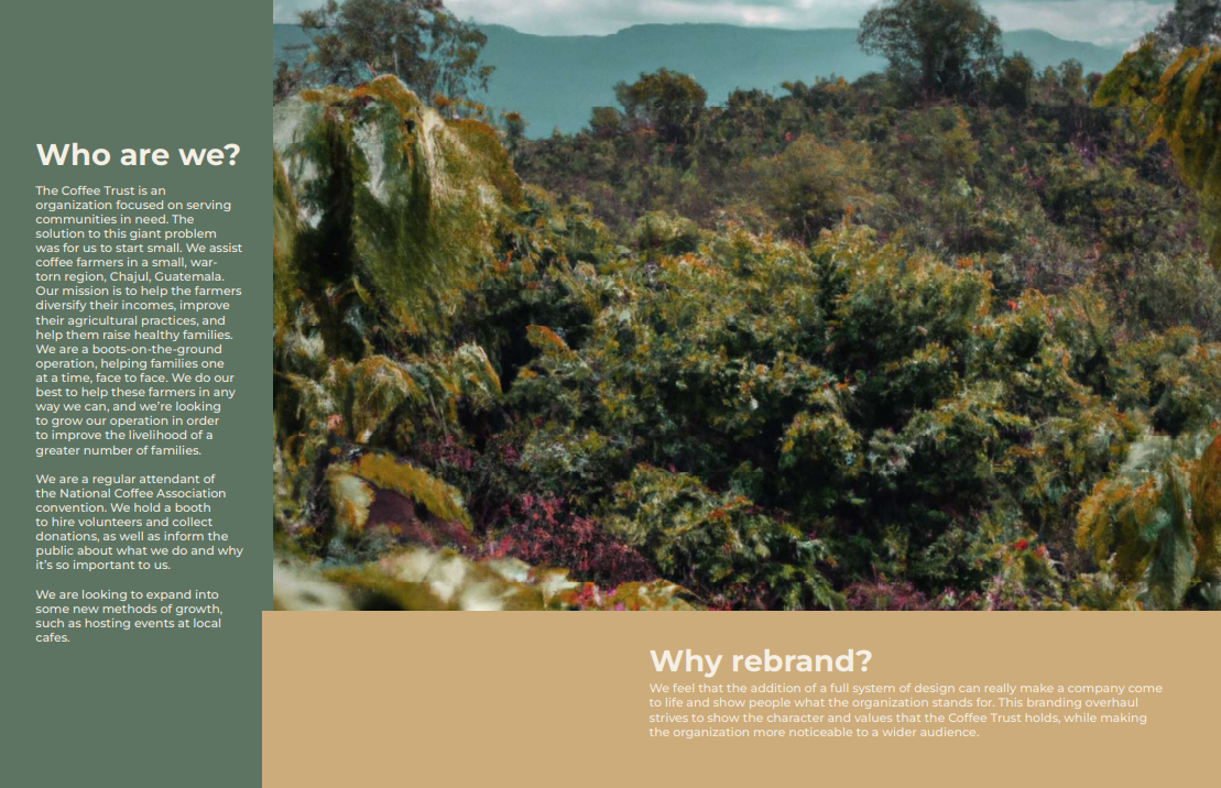
Who are we ?/Why Rebrand?

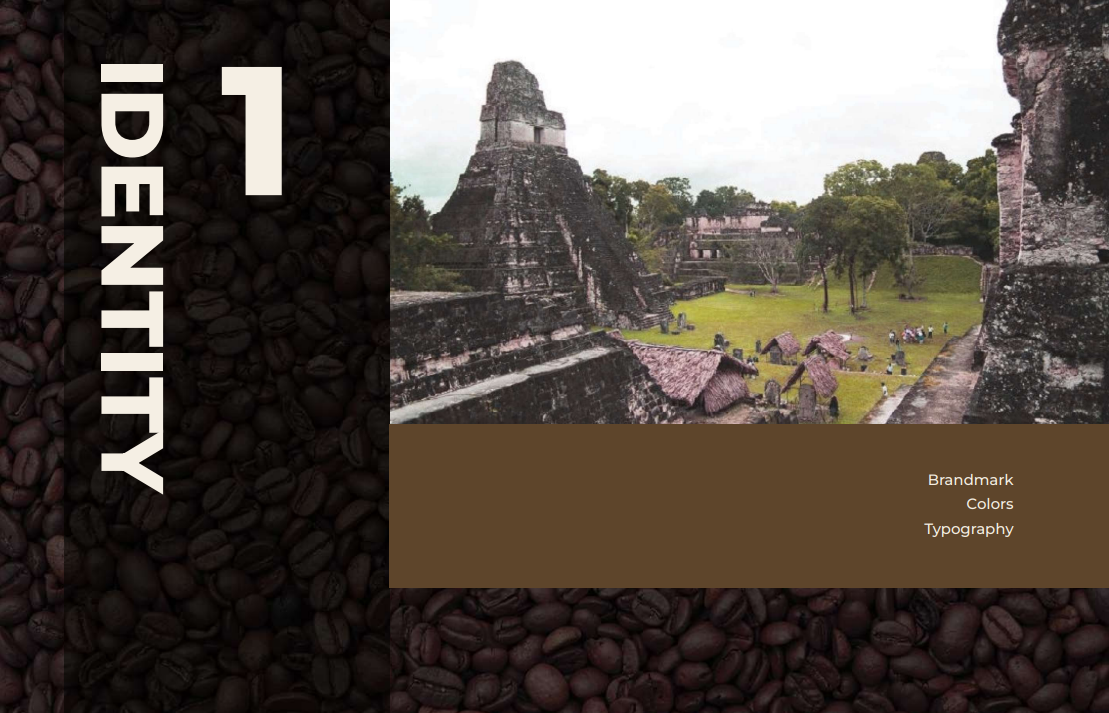
Section One Header Page

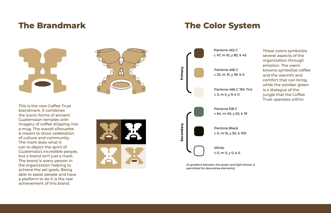
Brandmark/Color System

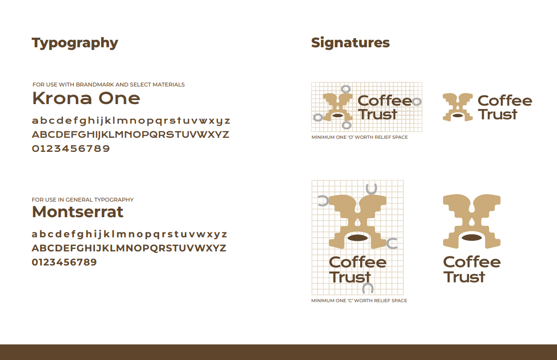
Typography/Signature Layout

Section Two Header Page

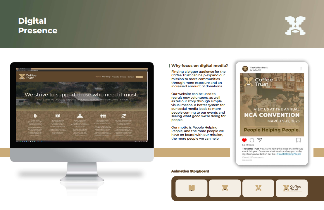
Digital Mockups/Design Language
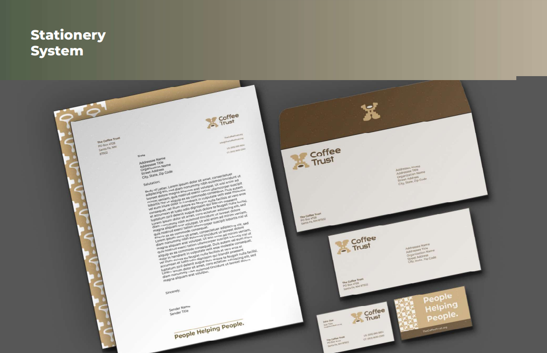
Stationery System

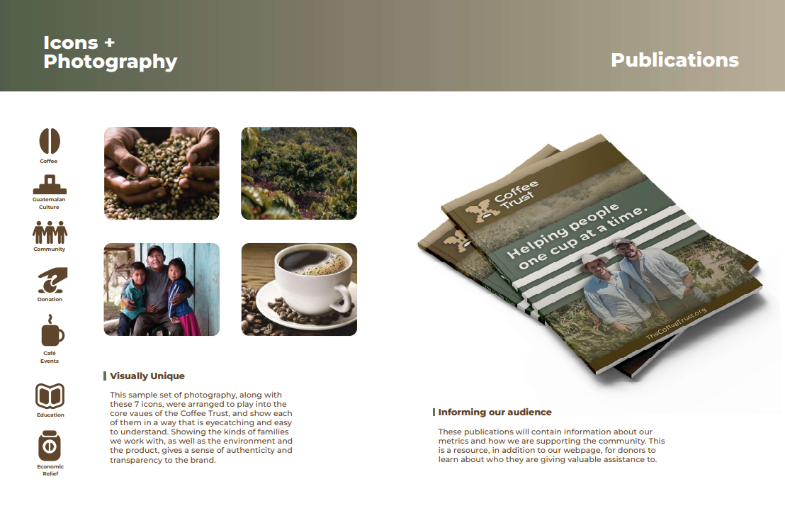
Icons/Photography/Publications

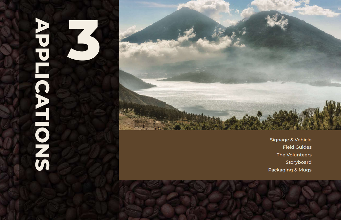
Section Three Header Page

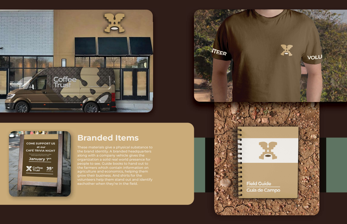
Branded items/merchandise

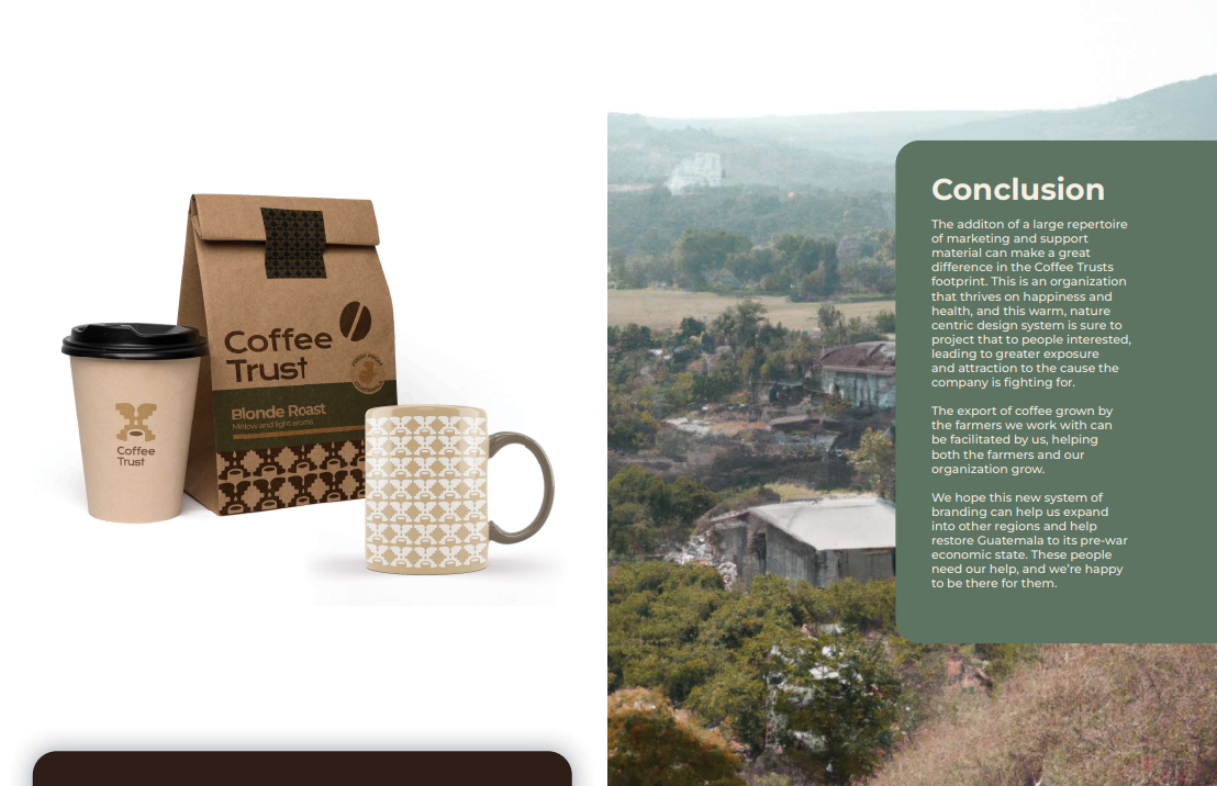
Merchandise Cont./Guide conclusion 

Back Cover

Process
This project started out with drafting brandmarks and picking iterations to develop upon. I knew that I wanted to relate the very strong culture of Guatemala and combine it with imagery of coffee. The first few weeks of development pivoted towards perfecting this idea. Below are images from this process of refinement.
​​​​​​​

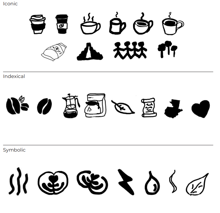
Initial sketches of related iconography

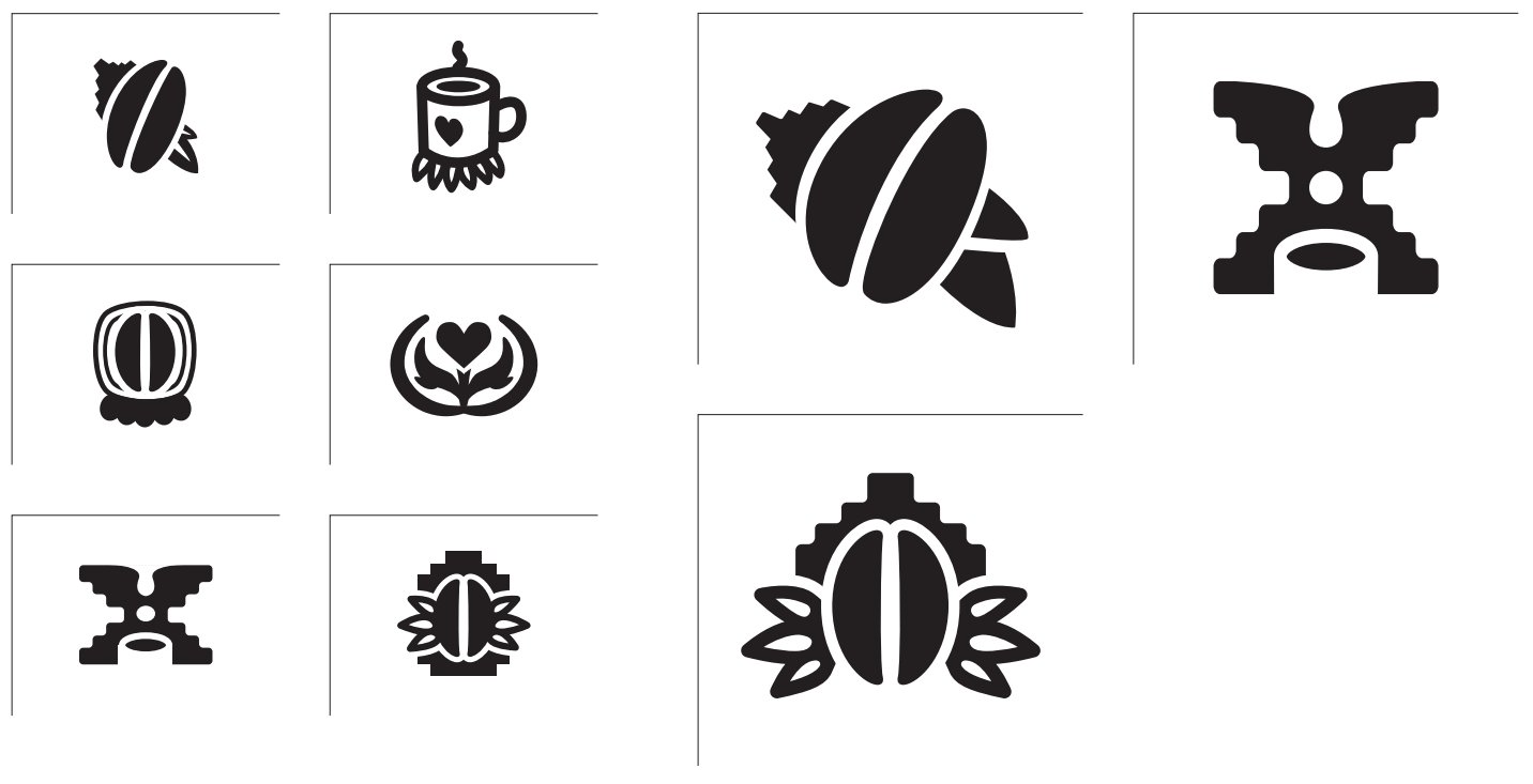
Left 6 boxes: Initial sketches of brandmark ideas Right: Refinements to the top three

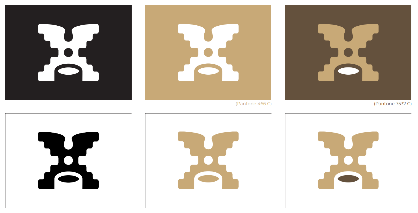
Color variation development

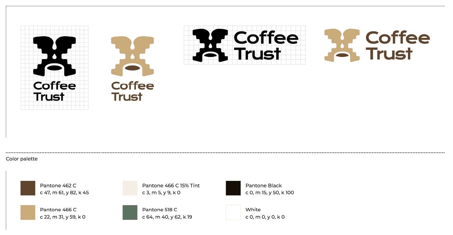
Final tweaks to the mark and development of signature/color system. This final design is meant to represent both the architecture of ancient Guatemalan civilizations combined with pouring coffee into a mug. It also has the goal of expressing joy through the abstracted image of a man standing on his hands in glee.

Once this was finalized, the next step was applying it and developing the rest of the brand identity. This included the stationery set, sample photography, icons, digital material, animation storyboard, package design, and other branded objects. These were all relatively straightforward to make and many only needed one iteration to get right and can be seen in the guide above.​​​​​​​
Reflection
The most difficult part of this project was getting the final brand guide together, as it took a few round of iterating and printing to get everything looking just right. Making the layout was something that taught me a lot about publication design and there's now quite a few things I would change were I to go back and redo this; one of those things being the cohesiveness of the guide. Some pages look wildly different from others because they were done with different mindsets for what that section represented. It provides more variety in what the brand looks like, however I think there might have been some better options for how to go about it. I'm still very happy with how this turned out though, and I'm very grateful to have had the opportunity to learn how to craft a brand identity from scratch, it's something I would have never imagined possible to do by myself, yet here we are. I gained many skills from this project and look forward to utilizing them more in my career.
Back to Top