
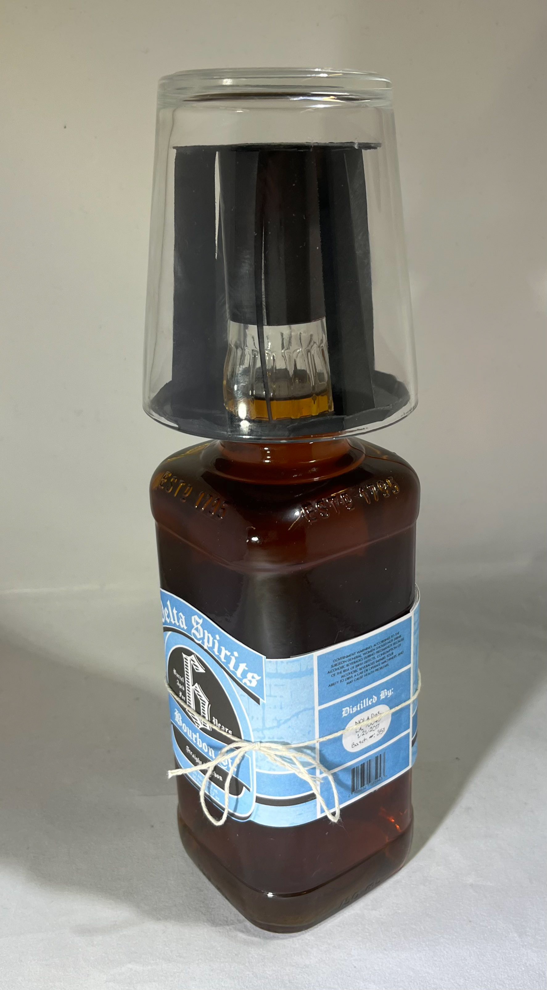
This was a group project for Professor Yvette Shen's data visualization class. My teammates were Kayla Eastman & Dana Richardson. The outcome was a bourbon packaging that describes the history of Bourbon St in New Orleans, LA. Also provided on the packaging is a small flipbook of bourbon recipes local to New Orleans. The bottle comes with a half-pint glass nestled on top.
Final Bottle Design
Process
The process for our team started in Miro, where we collected inspiration for what kind of package we wanted to do. The initial idea was to make a game out of the packaging, with the game pieces all being included as parts of the design. We eventually landing on making a New Orleans-centric bourbon brand after some brainstorming. The Miro board is pictured below to give a better idea of the thinking process.
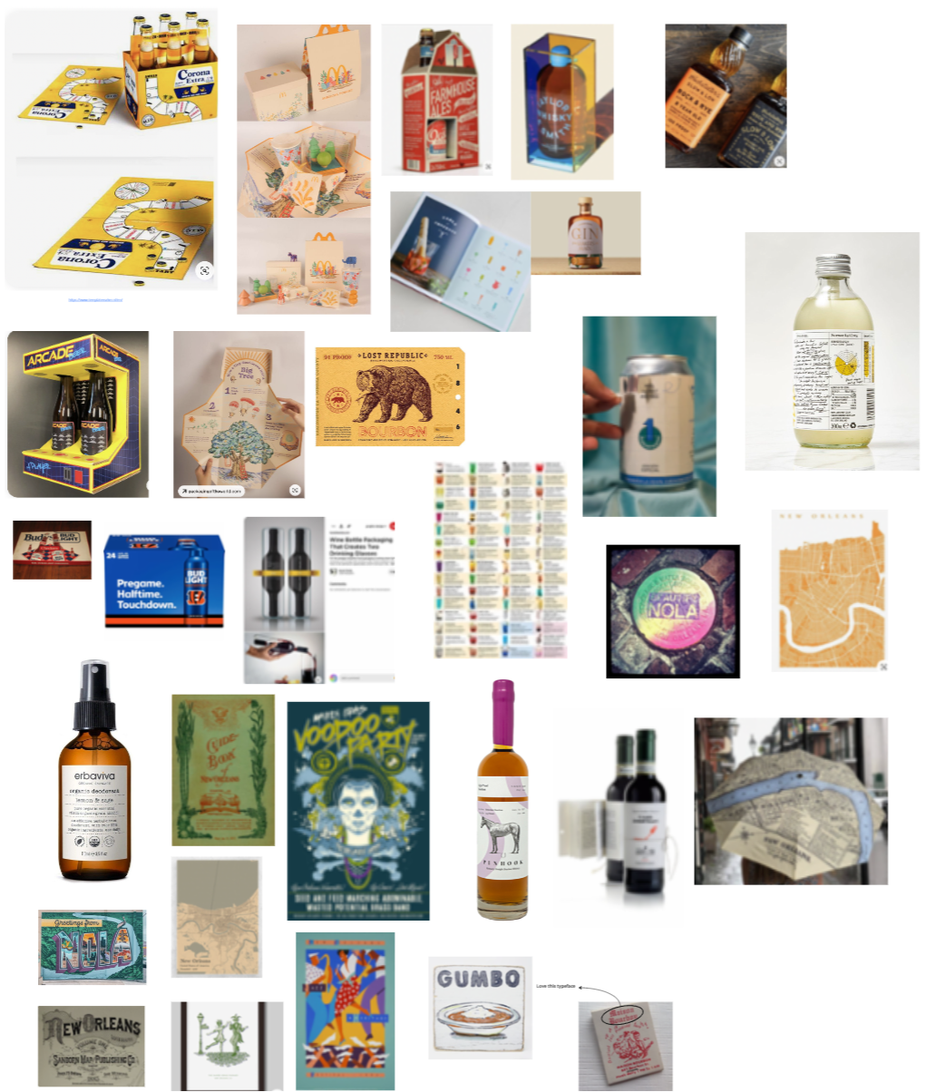
Inspiration Gathering
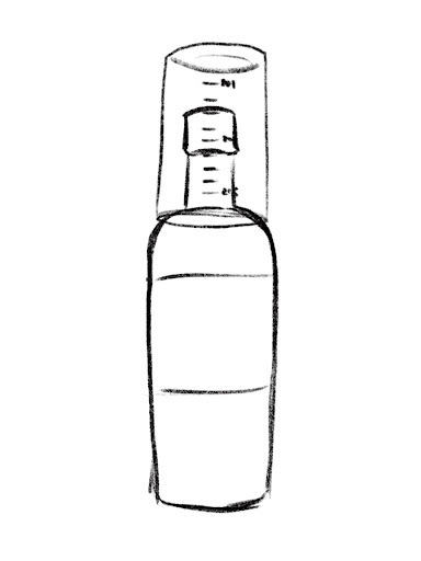
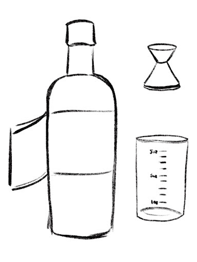
And then came time to research New Orleans history, specifically trivia about Bourbon St as that was the focus of our brand. Below is a quick snippet of our research board where we gathered ideas and went through revisions on our included recipes. We also made some sketches for what the package should actually include and how it all fit together. We ended up not including the shot measure because of space and time constraints.
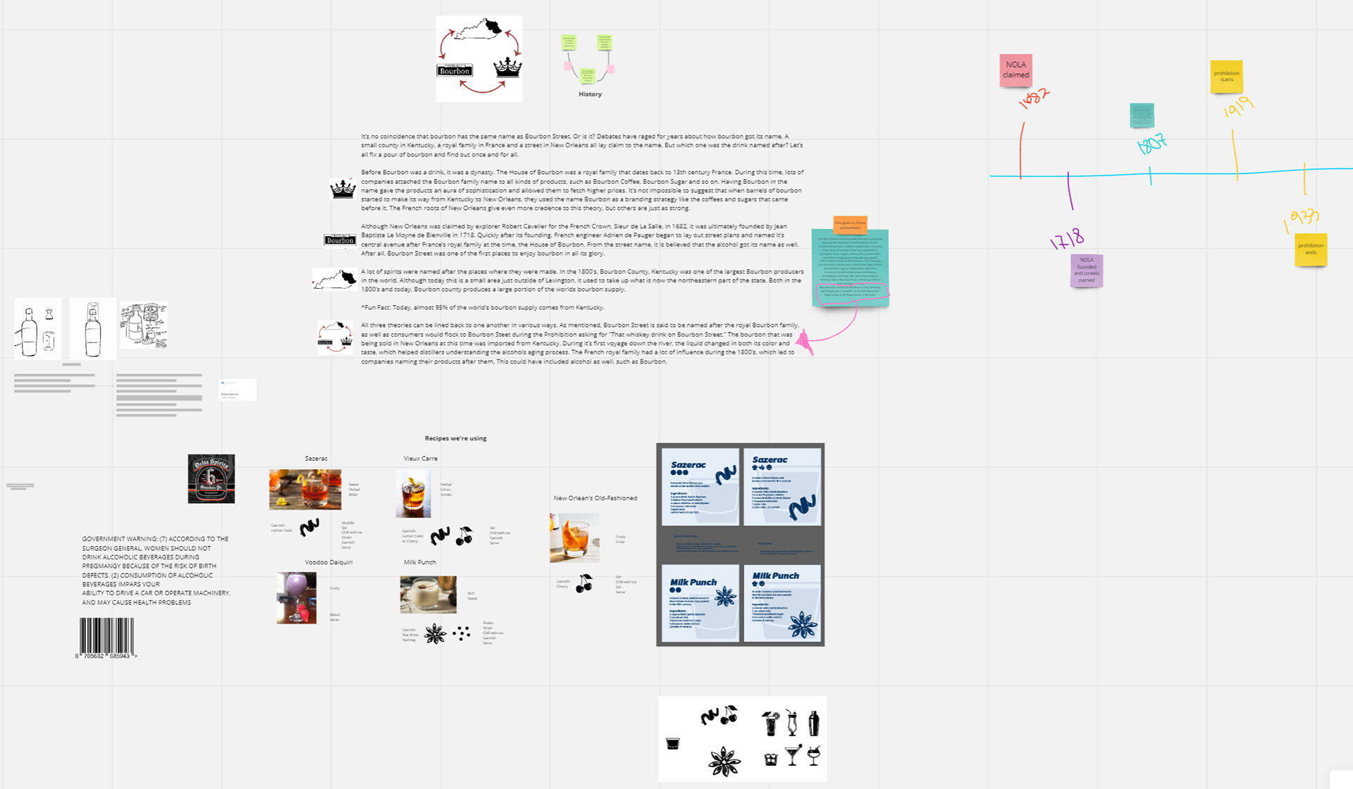
Research Process
After our research and concepting, we started working on the label design itself, which included the flipbook as well. This was the preliminary final before the recolor and reorganization:
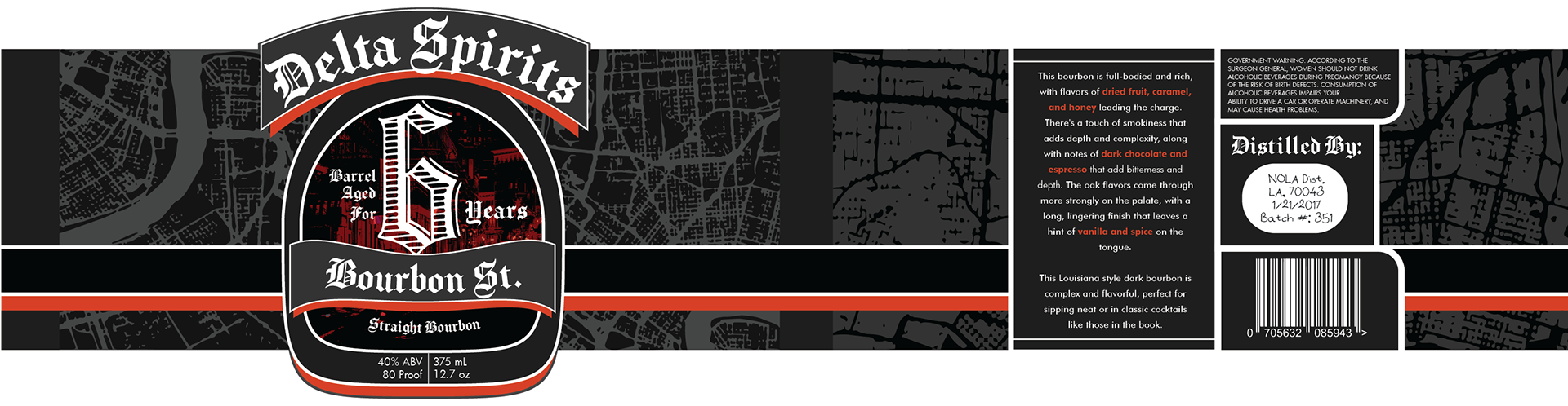
Preliminary Label & Flipbook Design
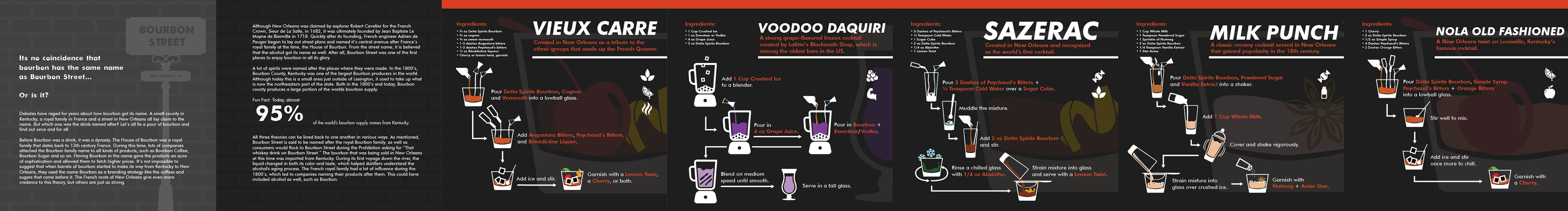
These recipes were quite challenging to find a good layout for, but through visualization we were able to find a simplified solution that mostly carried through to the final design.
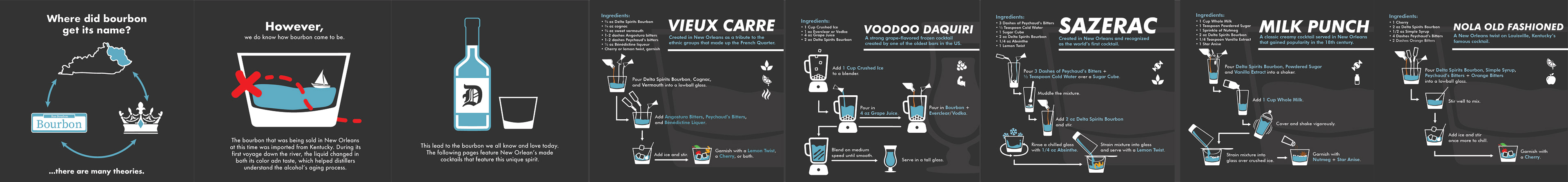
Final Label & Flipbook Design
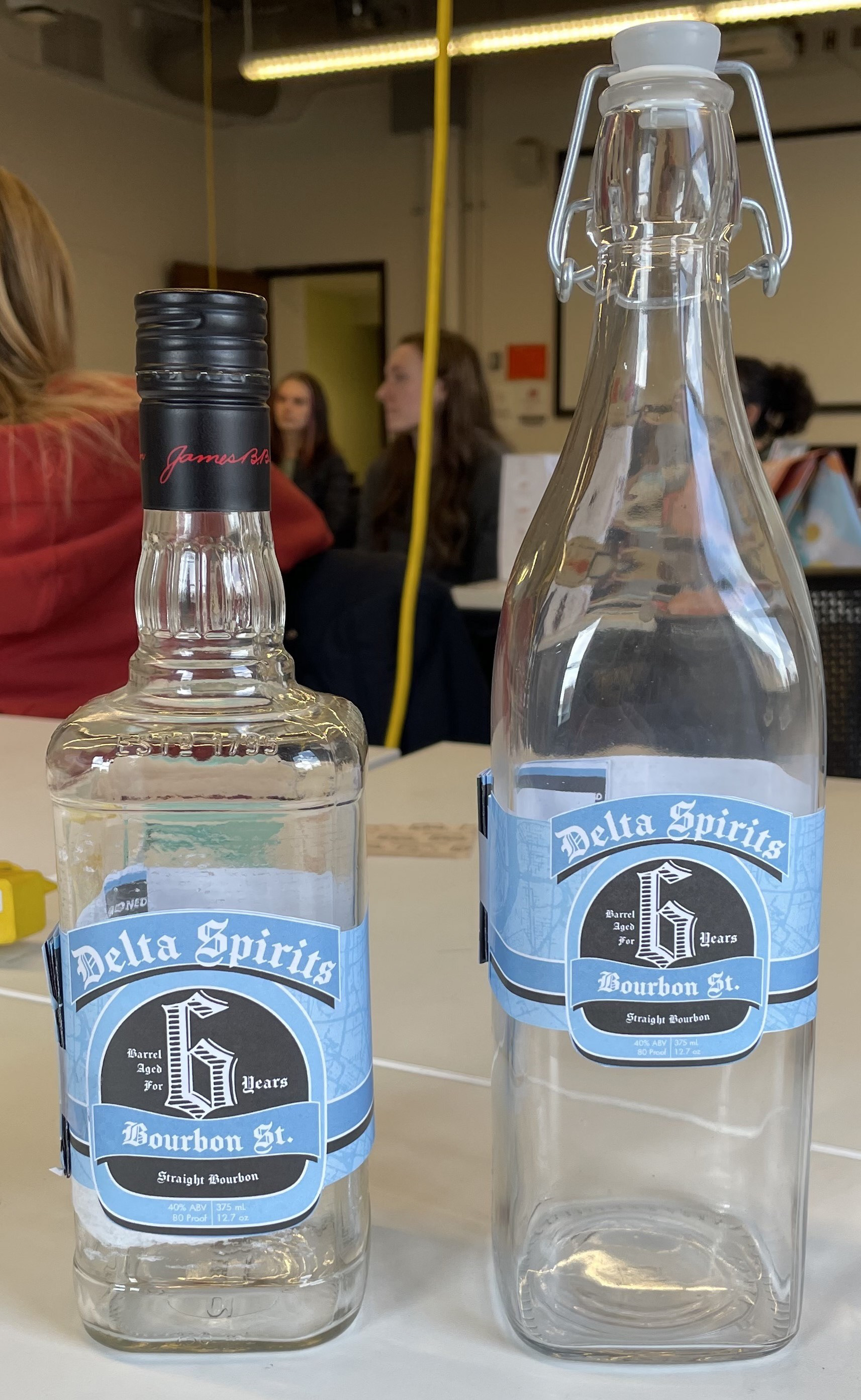
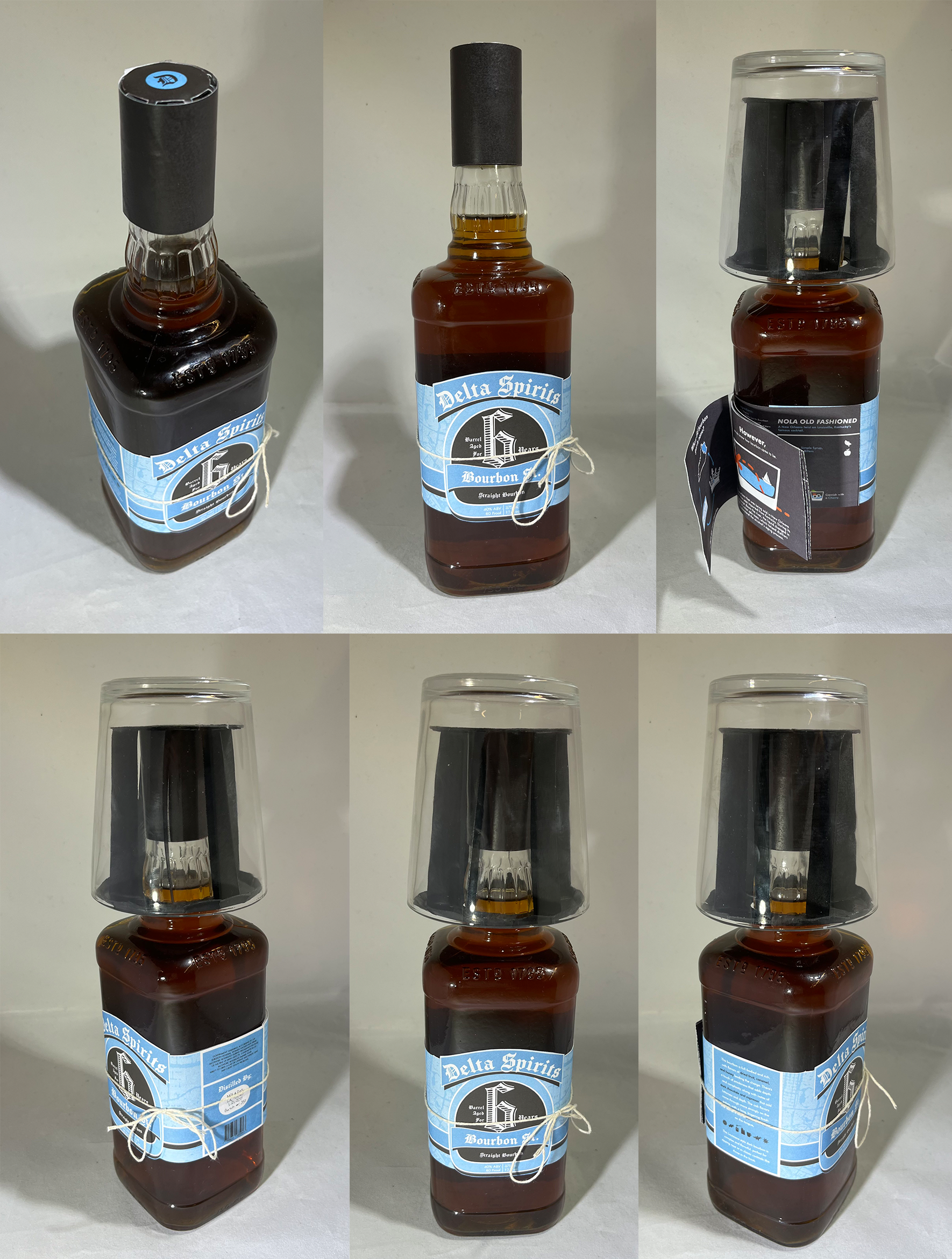
Testing different bottles
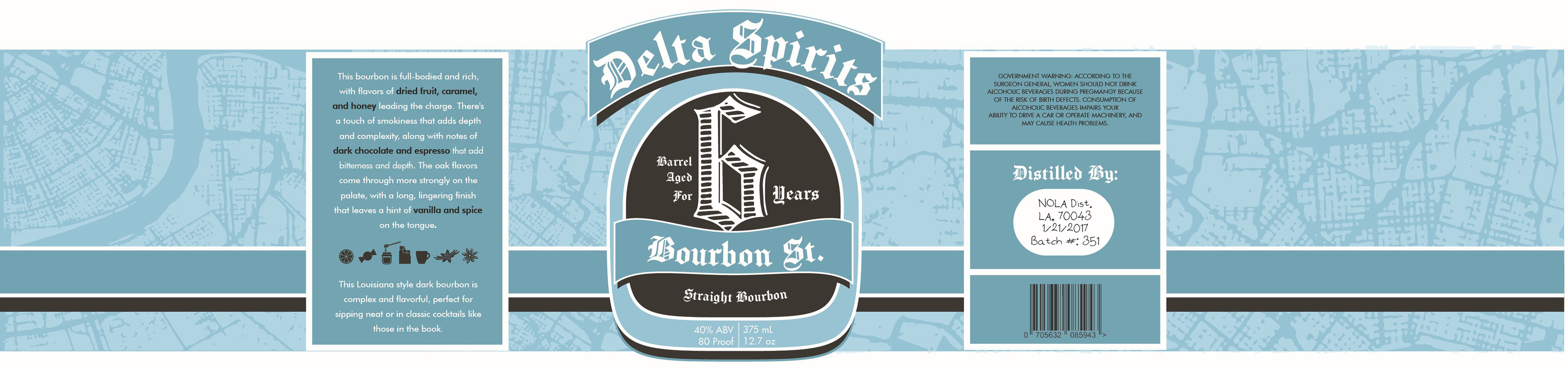
We then tested our labels on a couple different bottles to get an idea of final shape and size, we ended up going with the one on the left because it fit the theme more and the label feels much more in its place comparatively.
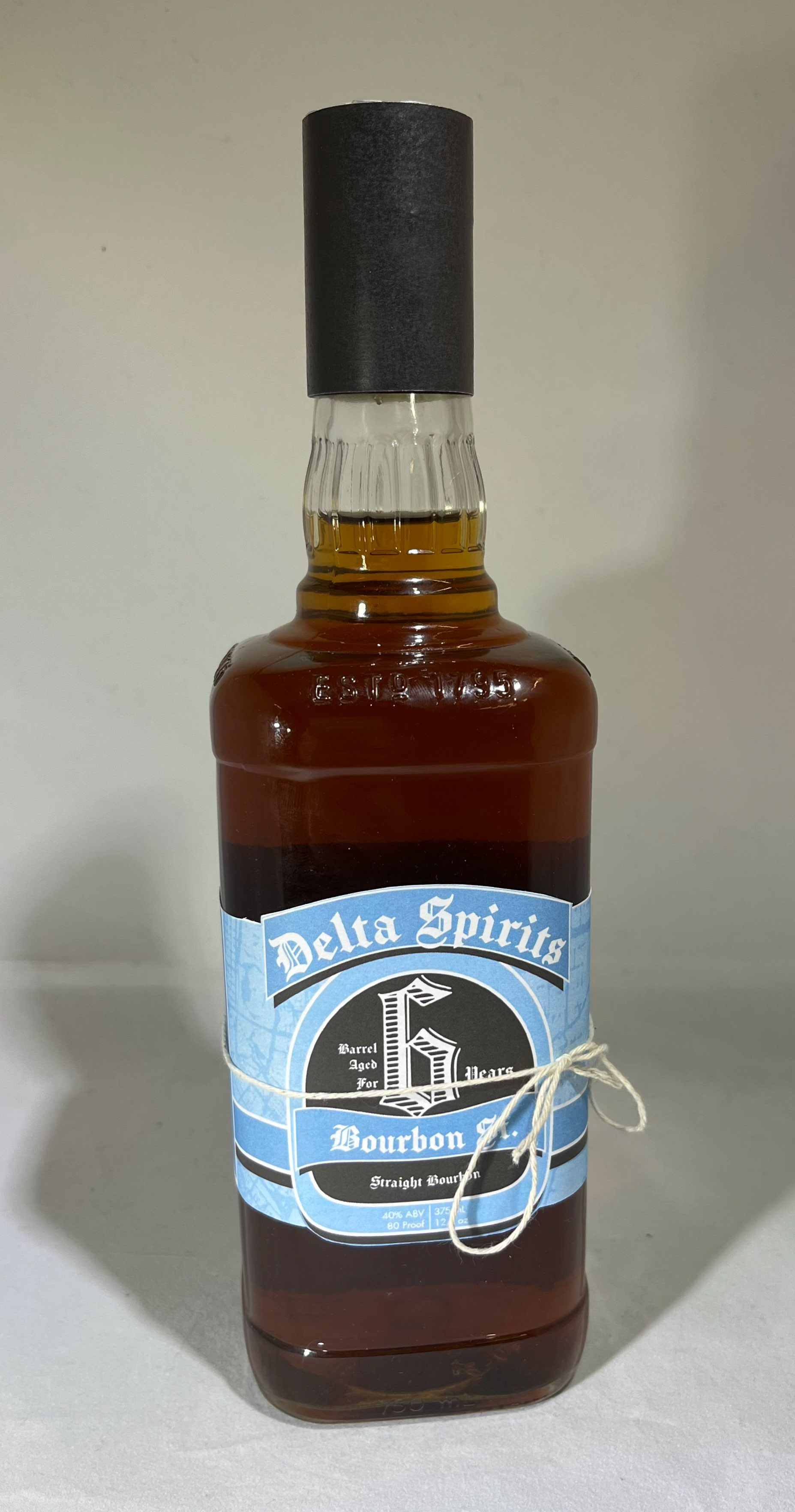
The final bottle design (without topper glass)
The final piece of this project was making the piece that held the glass snugly on top of the bottle. It was made from vellum sheets, CA glue, and spray painted black.
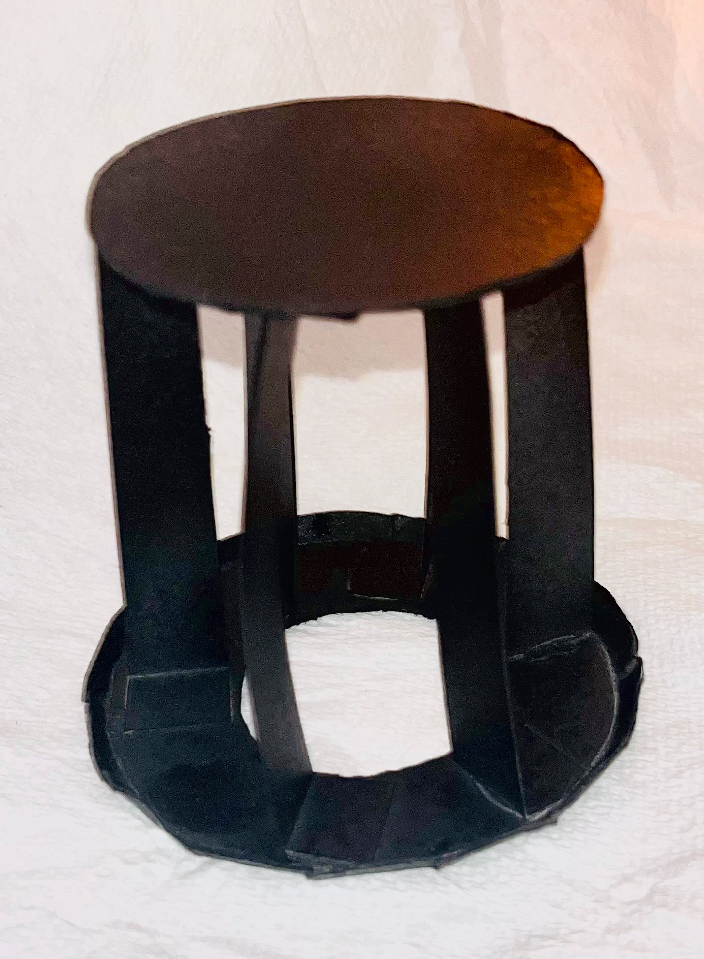
Topper Packaging
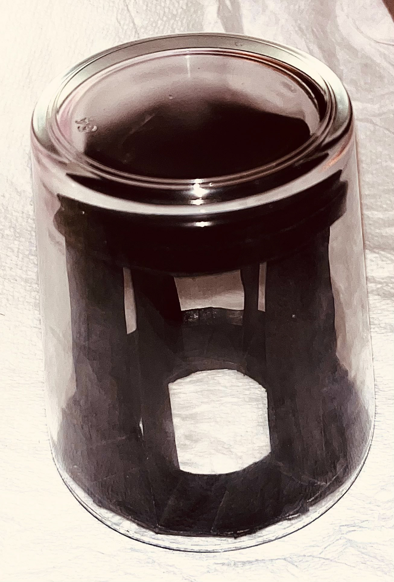
Topper with Glass
Reflection
I learned a lot about what goes into packaging design, from the actual shape and function of the package itself to the graphic layout. I feel much more comfortable taking on something like this in a future project and it was a fun experience to do something new like this.
One of the main challenges was figuring out how to fit such a large amount of information in a very limited and awkwardly shaped area. Finding the right materials also took a bit of trial and error but turned out well.
I wish we could’ve had time to make a box that contained the bottle and cup package, I feel like it would’ve made the end result a bit more eye-catching compared to competitors in the market. Without the box however there’s less waste in the actual shipped concept, so I’d like to think of it as a more eco-friendly solution. I would’ve also have loved to make the label multi-textural by having some areas in gloss and others matte, but obviously due to resource limitations we wouldn’t have been able to do that.
Overall this was a very enjoyable process and I’m proud of our team’s result. I’m now highly considering doing some packaging design as part of my career after having done this project.